The new logo had barely gone live before the comment section had already given Instagram a new name: Instagzam. The culprit is that "g" — its strokes are twisted so hard that it merges into the neighboring letters, making it look nothing like the original name.
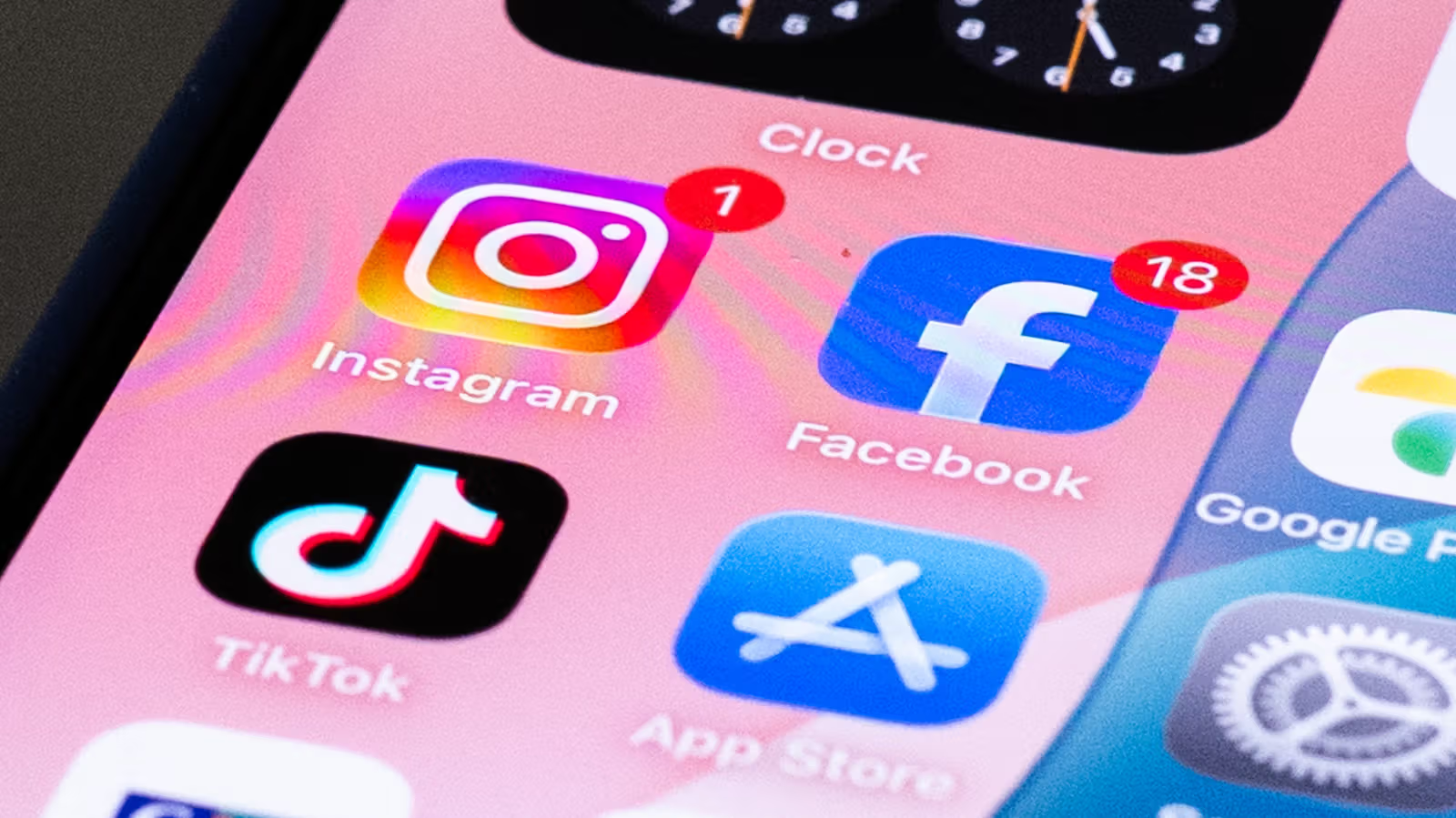
This marks the first time Instagram has touched its wordmark since 2016. The handwritten italic style everyone's used for nearly a decade has been swapped out for a "half handwritten, half print" design, with thicker strokes and exaggerated curves specifically applied to the letters "s," "r," and "g." As for the gradient camera icon users know so well, that's staying exactly the same — only the text at the top of the app interface got the makeover.
Jasmine Probst, the product design director behind the redesign, said the team tried hundreds of directions — everything from all-caps geometric fonts to versions that closely mimicked actual handwriting. The final version they landed on aims to keep that personal, handwritten feel while adding bolder, cleaner details with a touch of unexpectedness. Alongside the redesign, Instagram is also rolling out three in-house font families: Instagram Sans, Instagram Pen, and Instagram Mono. The official gradient color palette will also be used more sparingly across the interface, with the entire visual system expected to roll out globally throughout 2026.
Netizens' reaction turned out to be more blunt than the design team probably expected. Social media is flooded with side-by-side comparisons of the old and new logos, with people pointing out that the exaggerated letters make the whole word look nothing like "Instagram." Adam Mosseri, the head of Instagram, didn't dodge the criticism either — he reposted the redesign announcement to his own account, clearly bracing himself for a round of roasting from users. This rebrand essentially pulls Instagram's visual language closer to the more streamlined, systematic style of sibling platforms like Threads and Facebook — except this time, netizens read a whole new word first.