Hoe Hin White Flower Oil’s centenary project brings a six-month pop-up to MTR Hong Kong Station. Local creative partners GROCERY, TEAM GREEN and Pretty Useless Club extend the familiar bottle, label and green-and-white palette into clothing, everyday objects and DIY charms. The design story is how an established brand reconnects with different generations, rather than what its merchandise might imply about a medicinal product’s effects.
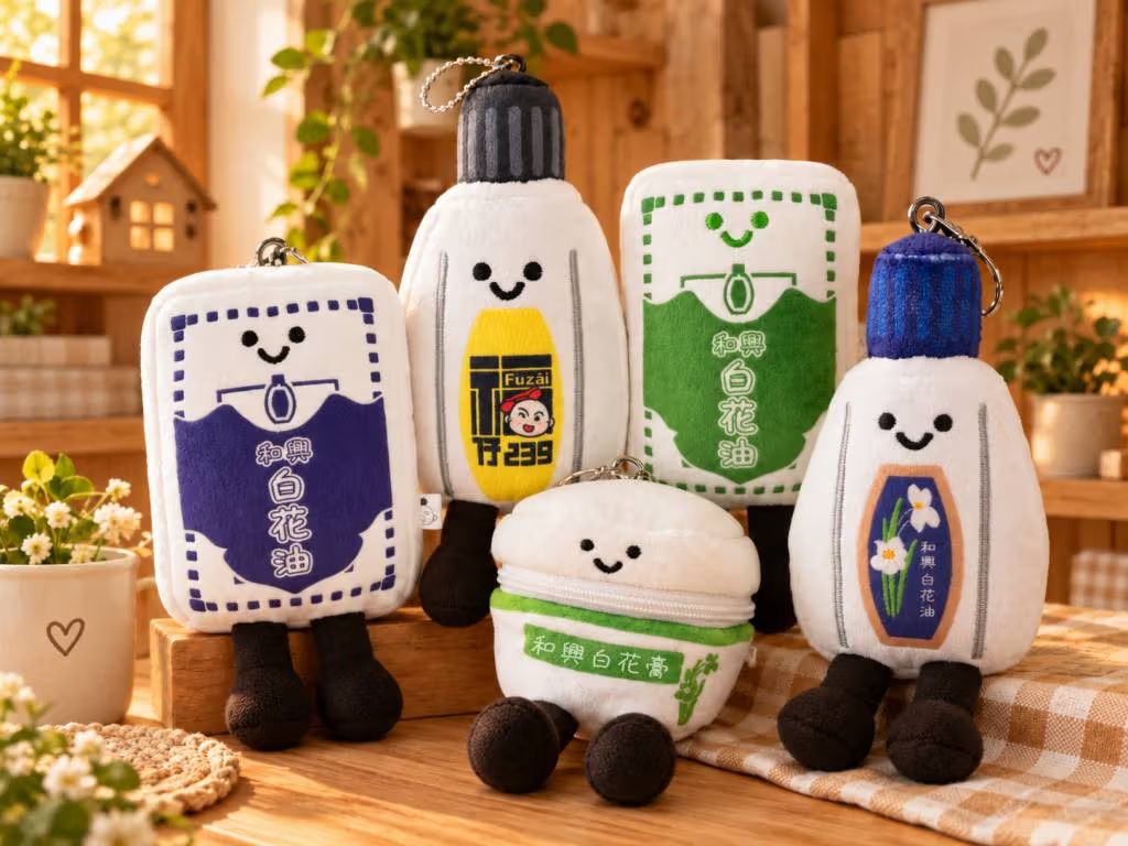
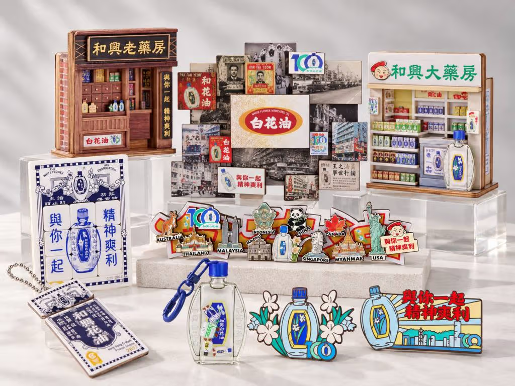
The centenary range includes several character-shaped objects.A selection of White Flower Oil centenary and collaboration items.
Green and white move from the medicine cabinet into a shop
The space uses the brand’s dark green and white alongside retro floor tiles and neon elements. Enlarging familiar symbols from a small bottle onto signs, walls and props turns memory into a place that visitors can enter. For design readers, scale is worth watching: which details remain recognisable, and which are adjusted to suit contemporary objects?
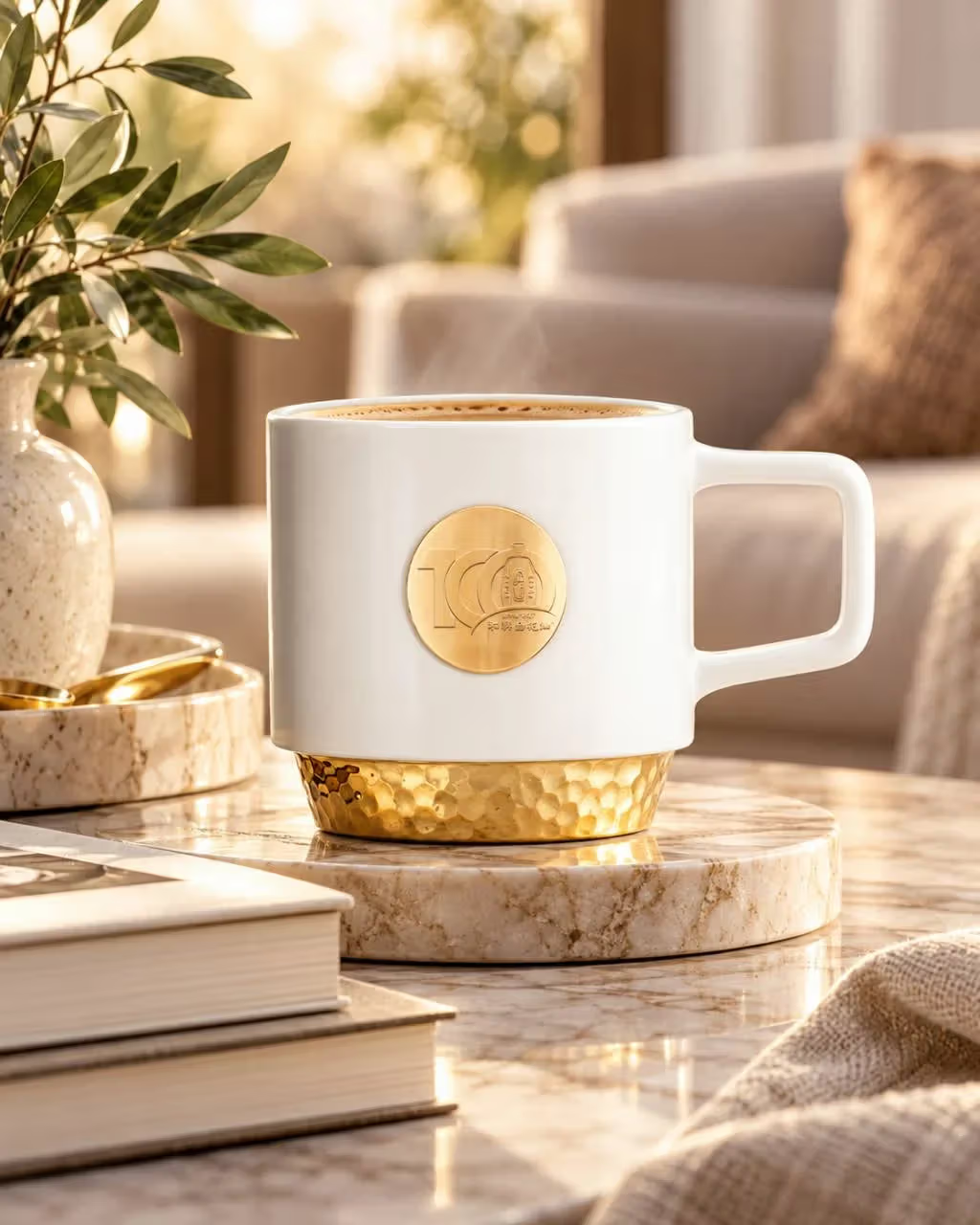
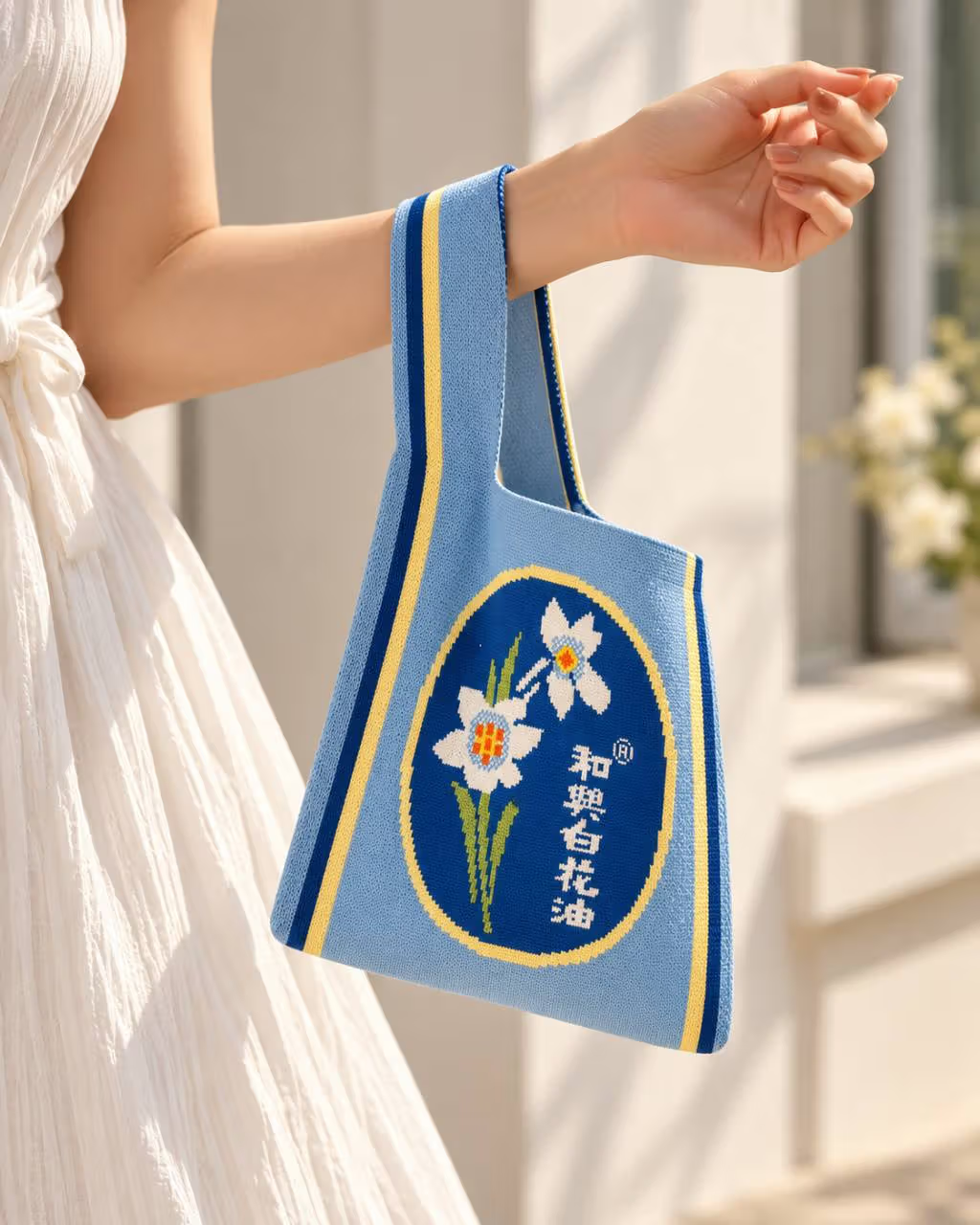
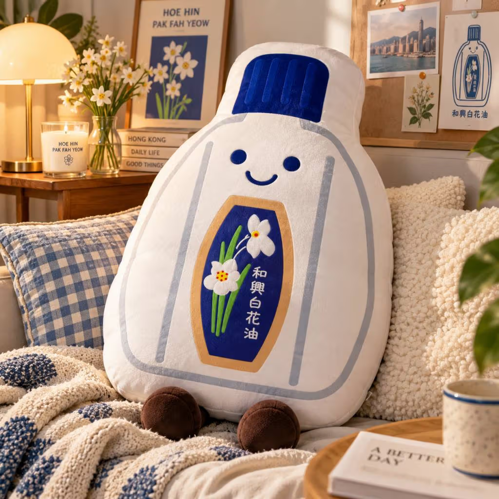
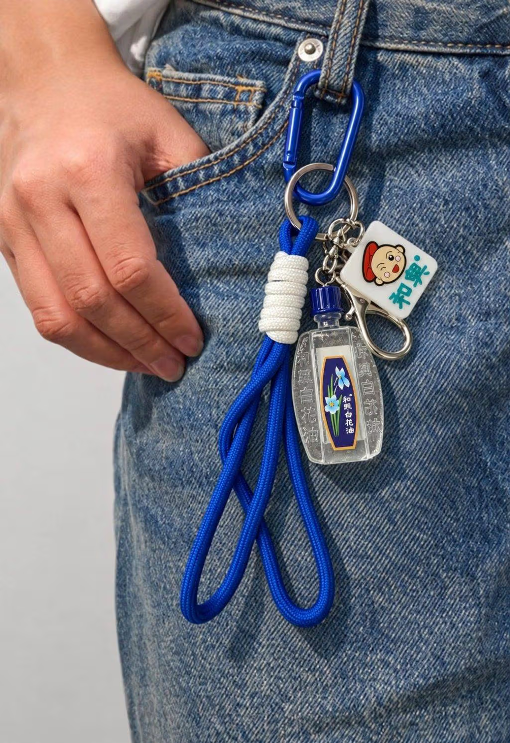
The brand’s own commemorative range includes Y2K-style phone straps, shaped keyrings, fabric bags, a gold centenary coffee mug, watches and cushions. Cups and bags focus on everyday use, while a bottle-shaped cushion enlarges a handheld object into something with a character-like presence. Thinking about use and storage helps clarify what kind of memory is worth keeping beyond the anniversary label.
The White Flower Oil gold centenary coffee mug.Bottle imagery extends onto a fabric bag.
GROCERY turns a familiar label into streetwear
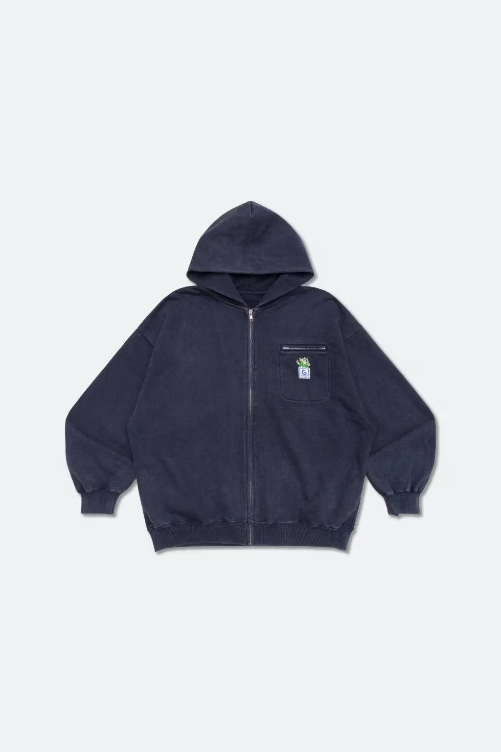
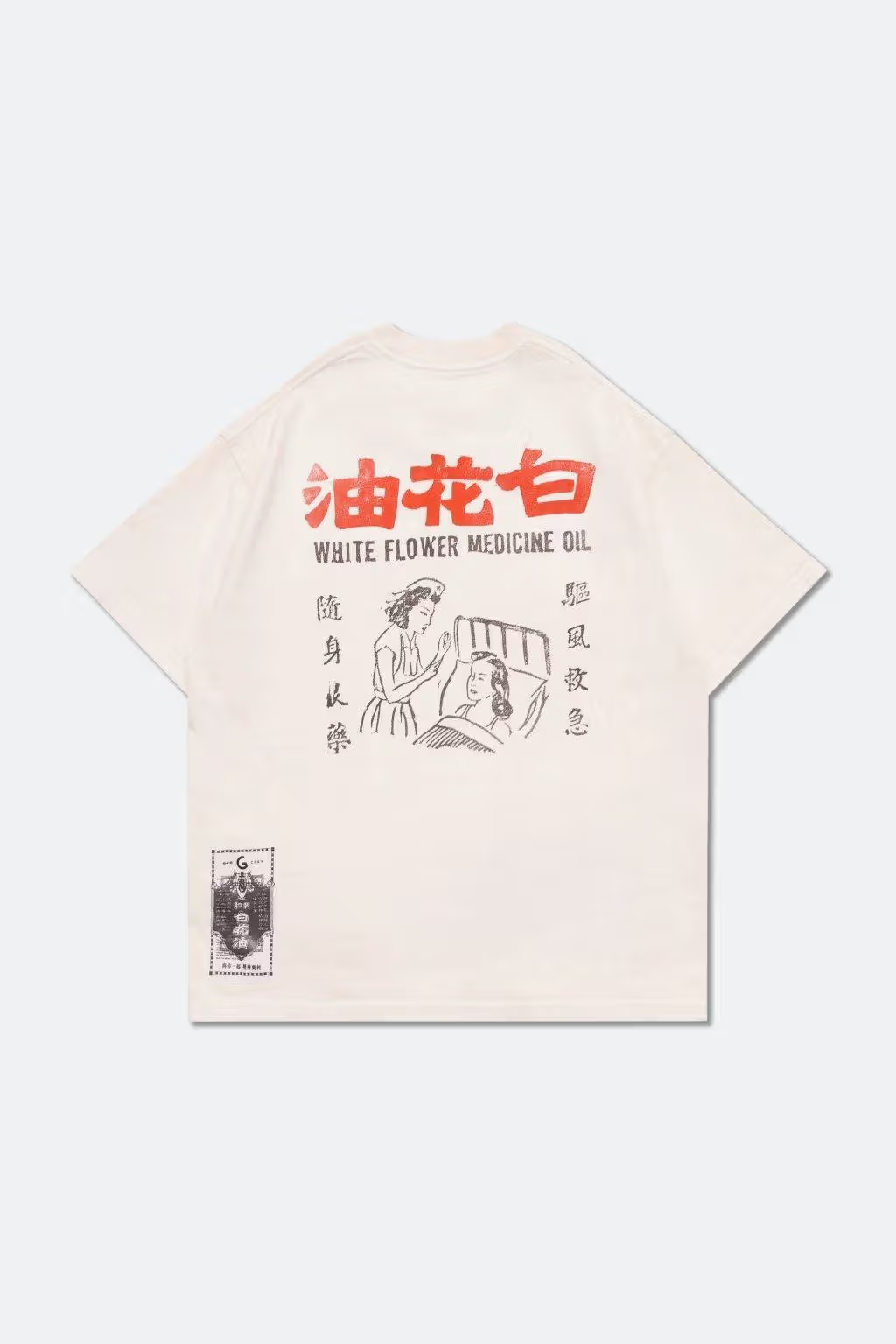
The local clothing brand uses White Flower Oil imagery across printed T-shirts, cropped and regular sweatshirts, denim jackets, hooded pieces and towels. Such collaborations are interesting where the order of packaging meets the freedom of dressing: retaining selected lettering, blocks of colour or outlines allows recognition while changing the context in which they appear.
A bottle-shaped cushion enlarges the familiar packaging silhouette.A hooded piece from the GROCERY collaboration.
Readers who rarely wear large graphics might begin with a T-shirt or a small accessory and keep other pieces simple. Those interested in collecting imagery can compare how each product handles the label and layout. Size, fabric and washing instructions still need to be read on the product; publicity photographs provide styling references rather than a complete assessment.
The GROCERY collaboration rearranges the imagery for clothing.
TEAM GREEN and DIY make the souvenir participatory
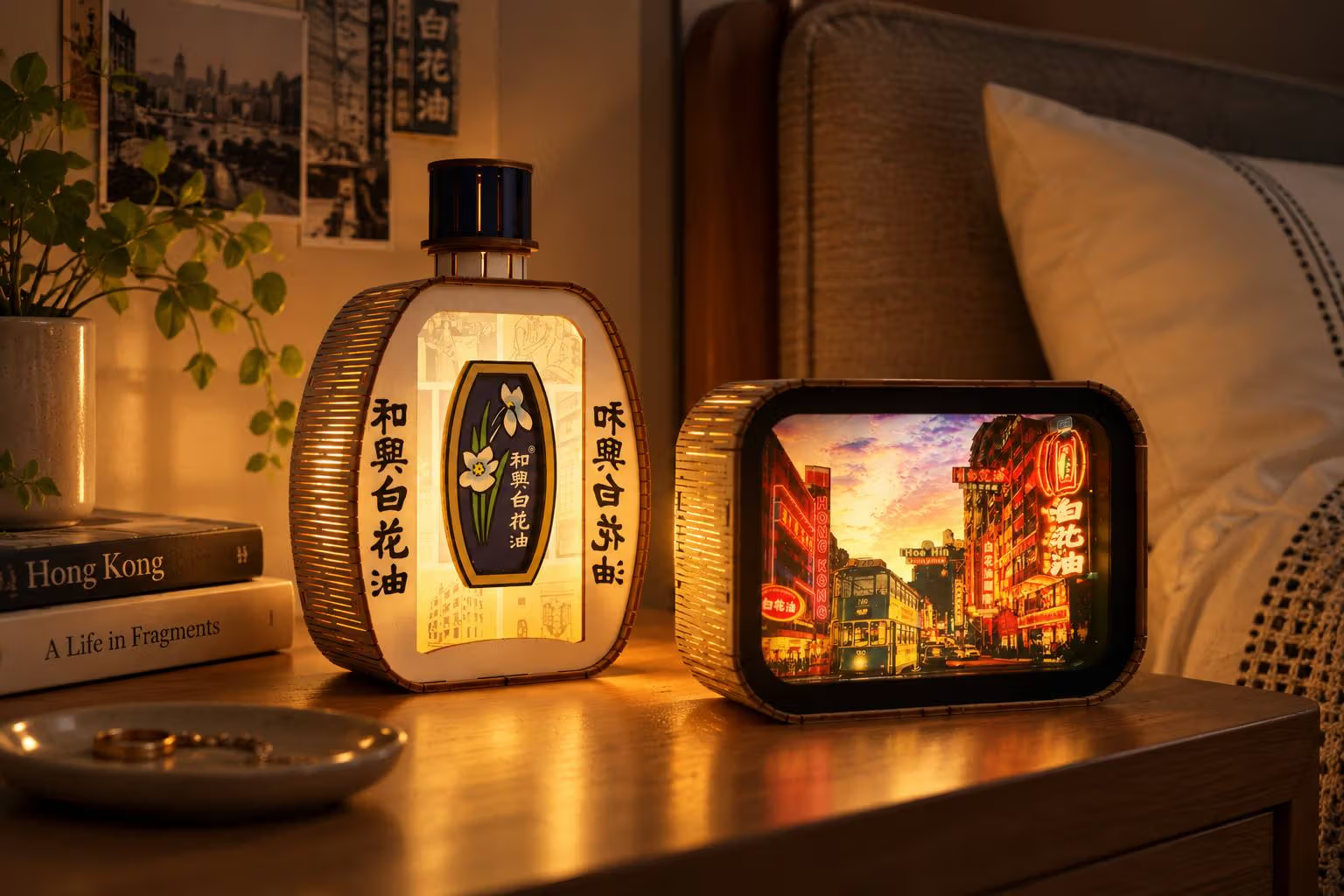
TEAM GREEN contributes limited-edition night lights, magnets, keyrings and small ornaments, bringing local memory to desks and domestic spaces. Pretty Useless Club operates a DIY Zone, where a purchase allows participation in assembling a fidget charm under the event arrangements. Making a personal combination adds a layer of choice to the souvenir and gives visitors a way to respond to the supplied images.
Phone straps and small accessories bring the imagery into everyday use.
What should visitors confirm before going?
The pop-up is at MTR Hong Kong Station and is planned for six months. The exact unit, daily hours, workshop availability and purchase conditions should be checked through the brand and MTR retail announcements. Limited products may arrive in batches, so a display photograph does not guarantee every item is in stock.
Roll-on products are also introduced in the store, but this article focuses on retail design and collaborative objects. Product use should follow formal packaging instructions. Moving from an established label to T-shirts, lamps and handmade charms, the project gives an everyday Hong Kong memory more forms to carry, use and reconsider over time.