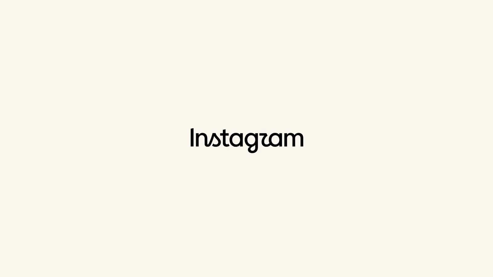
Forget whether it's actually "cleaner" or "more modern" for a second. Stare at Instagram's new wordmark for a full minute and a more practical question starts to surface: do these letters connect or not? It honestly looks like even the designers couldn't quite decide.
Instagram head Adam Mosseri personally dropped the new logo this past Thursday, framing it as a case of the brand being due for a "cleaner and more modern" refresh. No extra details were offered, and no explanation was given for why two completely different lettering logics got smashed into a single word—but that's exactly what makes this whole thing so fascinating to pick apart.
The new wordmark is half cursive script, half standard sans-serif print, and the two logics layered on top of each other create some genuinely awkward moments: letters that should connect don't, and letters that shouldn't connect suddenly do. The most obvious offender is the "t" and "a," which fuse directly into one another, forming a strange hybrid glyph. The "r" in the middle is also stuck in connection limbo, looking like the design got frozen mid-decision. Even more subtle is how the "g" wraps up—that descending curve looks like it's supposed to swoop into the next letter, but instead it just hangs there in mid-air with nothing to connect to.
Stare at the whole word long enough and you'll start questioning your own eyes—glance at it too quickly and it's shockingly easy to read as "Instagzam" instead of "Instagram." For a brand wordmark that's supposed to prioritize instant recognition, that's a pretty rough reading experience to ship with.
There's no word yet on when the new logo actually rolls out, where it'll be applied, or whether it'll gradually replace the current one. Mosseri's announcement itself doesn't go much further than a casual "it was time."