Van Cleef & Arpels Relocates to Alexandra House, Letting Studio Jouin Manku's Hand-Carved Plaster Petals Push Back Against Central's Noise
Moving from Landmark Mandarin Oriental to Alexandra House, Van Cleef & Arpels reunites with longtime collaborator Studio Jouin Manku, answering two decades of the city's clamor with a single expanse of hand-sculpted plaster petals.
Central's luxury storefronts tend to speak at one volume: oversized signage, sharp lines, brand symbols recognizable from a distance. It's the survival logic of this city — amid vertical skylines and high-speed information, quiet equals forgotten. But Van Cleef & Arpels has always stood on the opposite side. Its facades have long kept the logo deliberately understated, using a kind of restraint that invites the curious to come closer on their own. This time, moving from its 2011 home at Landmark Mandarin Oriental to a new store at Alexandra House, the brand has pushed that philosophy to its furthest point yet.
Leading the project are architects Patrick Jouin and Sanjit Manku, founders of Studio Jouin Manku, who have worked with the brand for two decades. This isn't a simple relocation — Jouin calls it outright "Version 3," the third iteration of the brand's Hong Kong identity. "We're twenty years older now," he says. "We understand the brand more deeply, and we understand how it operates internally. Because we refuse to repeat ourselves, every time we have to find new boundaries within the brand's DNA."
A Facade Made of a Single Sculpted Bloom of Plaster Petals
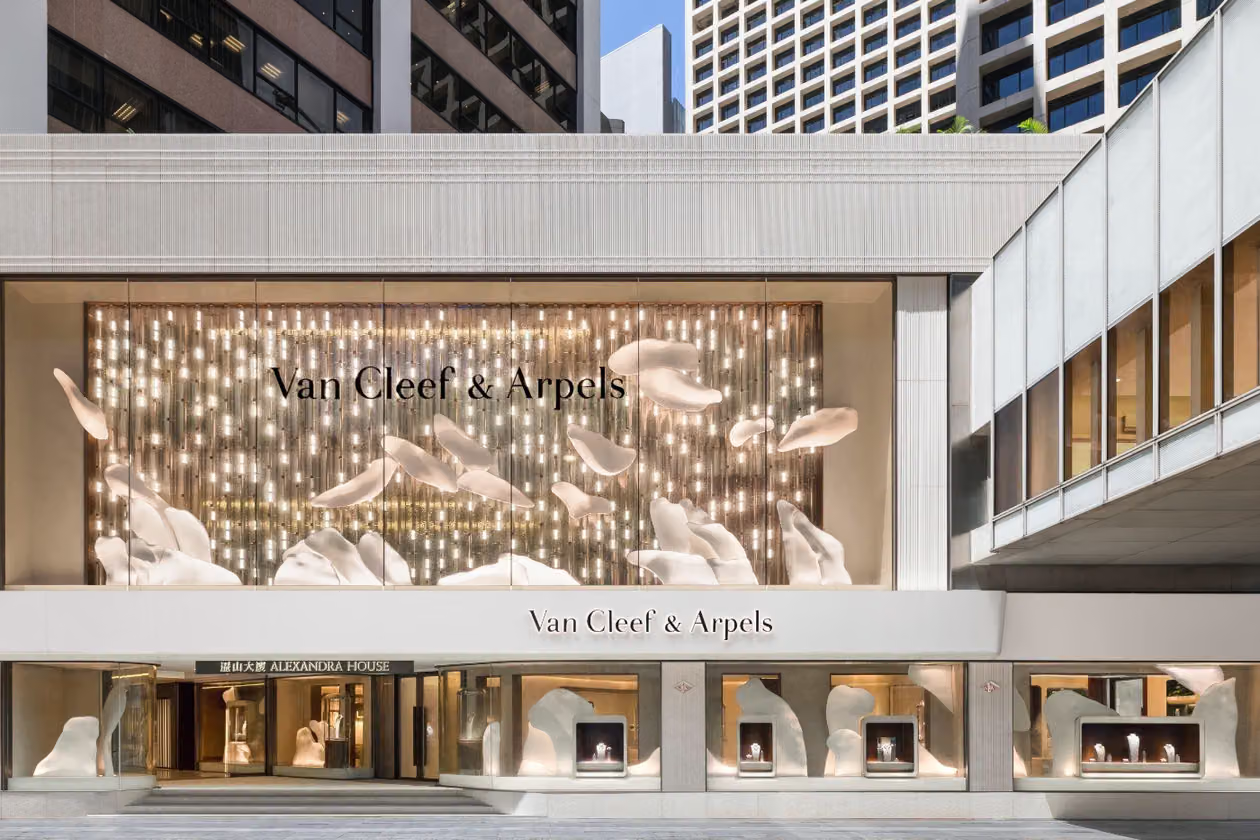
The new store's facade is an 825-square-meter expanse of stone and textured glass, built around a concept called "Rain of Light." Covering it are enormous white plaster petals, all hand-carved by English craftsmen. "Can you catch people's attention in a city where everyone is shouting, but by whispering instead?" Manku asks himself. "We believe you can — as long as that whisper carries enough depth."
Behind that whisper lies a genuinely tough engineering problem. The facade had to withstand typhoons and extreme weather, resist decay, and pass rigorous structural safety codes. The design team experimented with papier-mâché techniques, 3D printing, and heavy plaster mockups before finally developing a special formula close to traditional plaster, which was handed to English craftsman Tom Palmer to carve. What the public sees, Manku says, is elegant organic linework; what they don't see is the global coordination between the Paris design team, English craftsmen, Hong Kong partners, and mainland Chinese fabrication teams — "Heavy engineering has to be solved perfectly, yet remain completely invisible."
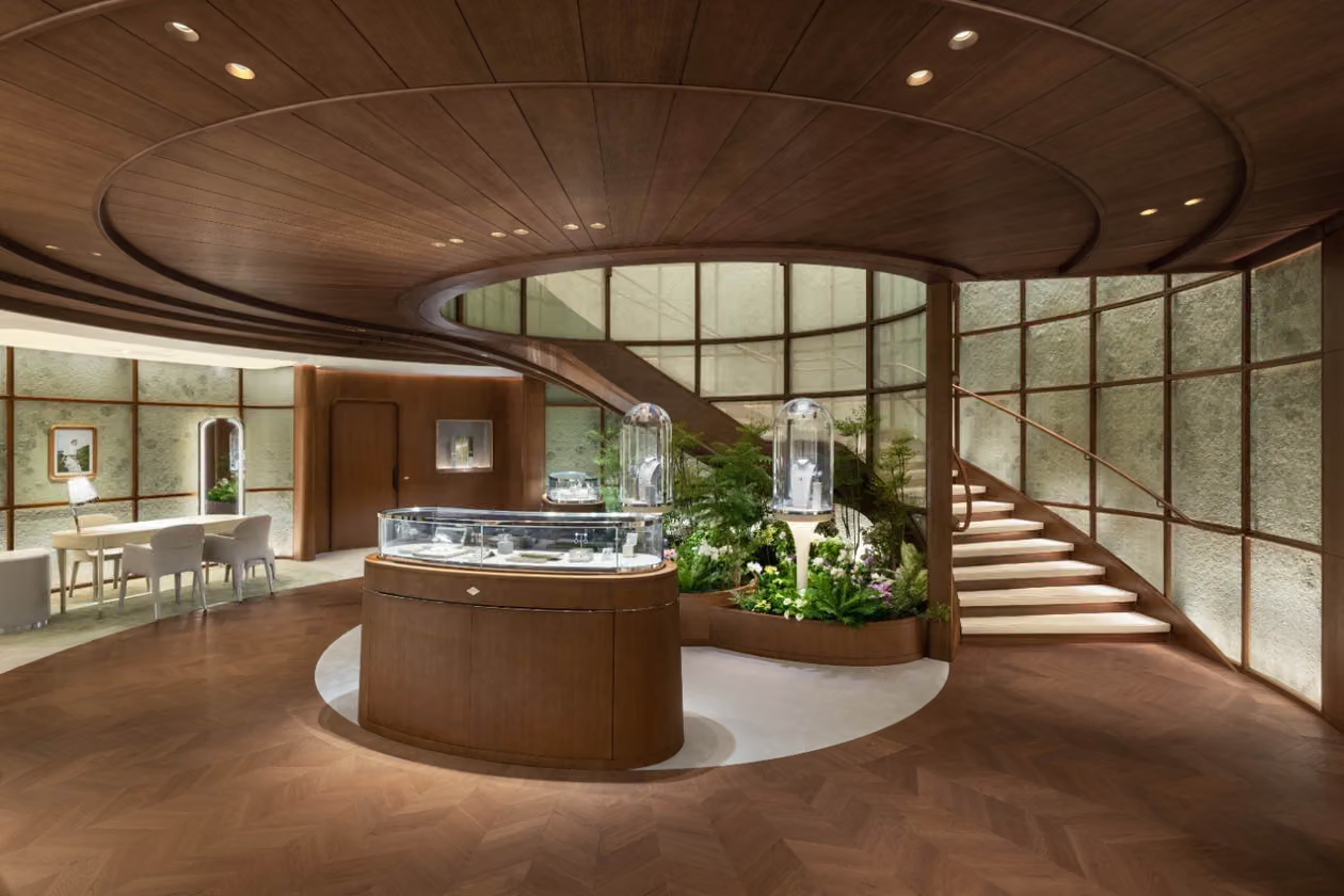
Inside, a spiral staircase in oak and pale limestone runs through the floors. The floor plan has no dead ends and deliberately avoids sharp corners. "A sharp corner forces you to make a decision — go left or right," Manku explains. "We believe guests shouldn't be forced into structural judgments during an aesthetic journey. They should be gently guided along, like a child walking into a candy store, where you can't go wrong no matter which way you turn." The logic comes from jewelry itself — jewelry is worn on the curves of the body, and the human body has no straight lines.
Three Entrances, Three States of Mind
Alexandra House's architectural conditions are entirely different from the old store. The previous location was a standalone storefront where customers stepped straight in from their cars, in a space that was vertical and concentrated. The new store has three entrances: those entering from the mall's ground floor arrive already in the rhythm of a bustling shopping trip; those coming down from the pedestrian bridge only catch a slanted glimpse of a corner of the store; those dropped off at the corner driveway walk straight toward a triple-height entrance. Three ways of entering, three states of mind — the architecture has to respond to each. This is what Manku repeatedly calls "emotional choreography" — the rhythm of the space must adjust to whatever state a person is in the moment they walk through the door.
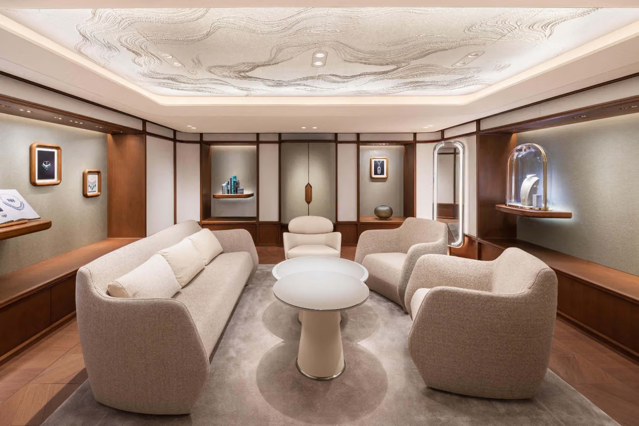
Jouin brings the entire design philosophy back to a small metaphor: "In a fast-paced city, it's easy to walk past a flower without ever really seeing it. But when you slow down and look closely, you notice the gradient from green to deep red in the petals — and if you've ever tried to replicate that transition in paint, you know how difficult it is." He says that twenty years ago, when the team first took on the brand, they knew nothing about jewelry — the only thing they understood was how to build a narrative bridge between historical heritage and contemporary design. So the interiors were designed to be quiet, rich, and elegant, with the architecture itself deliberately receding into the background so the focus stays on the jewelry.
Manku speaks to the meaning of this quietness from another angle: in an era dominated by phone screens, spaces around the world have started to look increasingly alike. People chase the loudest, brightest digital stimulation of the moment while, in the post-pandemic era, desperately searching for genuine calm. "Our goal is that the moment you walk through the door, you want to put your phone down." Only when a space lets your shoulders naturally relax do you have the chance to truly take in the craftsmanship details within — a single piece of high jewelry often takes multiple artisans a full year to complete.
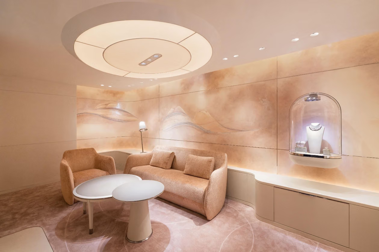
One of the store's private salons is designed specifically for tea service, with walls in soft pink and peach tones that look, from a distance, like a painting — only up close do you realize the textured surface is made by embedding crushed stone and natural mineral powders into wall panels, the work of French mineral artist Caroline Besse, who previously collaborated with the duo on a project at Place Vendôme. The wall isn't a finished piece completed in one go: over the coming months, the team will return to continue hand-painting cloud patterns onto it, letting it grow as a living canvas.