Hiroshi Nagai’s STILL HERE: Looking Beyond City Pop Covers
At Tokyo’s GALLERY TARGET, Hiroshi Nagai presents about 20 new and older originals through November 13, including the original artwork for Eiichi Ohtaki’s Kimi wa Tennenshoku. Pools, coastlines and buildings guide the viewing.
Hiroshi Nagai’s solo exhibition STILL HERE opened at Tokyo’s GALLERY TARGET on October 22, 2026 and continues through November 13. It brings together around 20 new and older originals, with a special display of the original artwork used for Eiichi Ohtaki’s single Kimi wa Tennenshoku. For visitors who discovered Nagai through record sleeves, it provides a route from musical imagery back to painting itself: familiar seas, pools, palms and buildings can be reconsidered within one exhibition.
Why is Nagai so closely associated with City Pop?
Born in Tokushima in 1947, Nagai began working in advertising and publishing illustration in the 1970s. His artwork for Ohtaki’s 1981 album A LONG VACATION made him widely known. His landscapes became an important part of Japanese City Pop’s visual culture. That connection explains how many listeners encountered the images, while the artwork used on an album and a painter’s long-developed landscape vocabulary still invite different scales of attention.
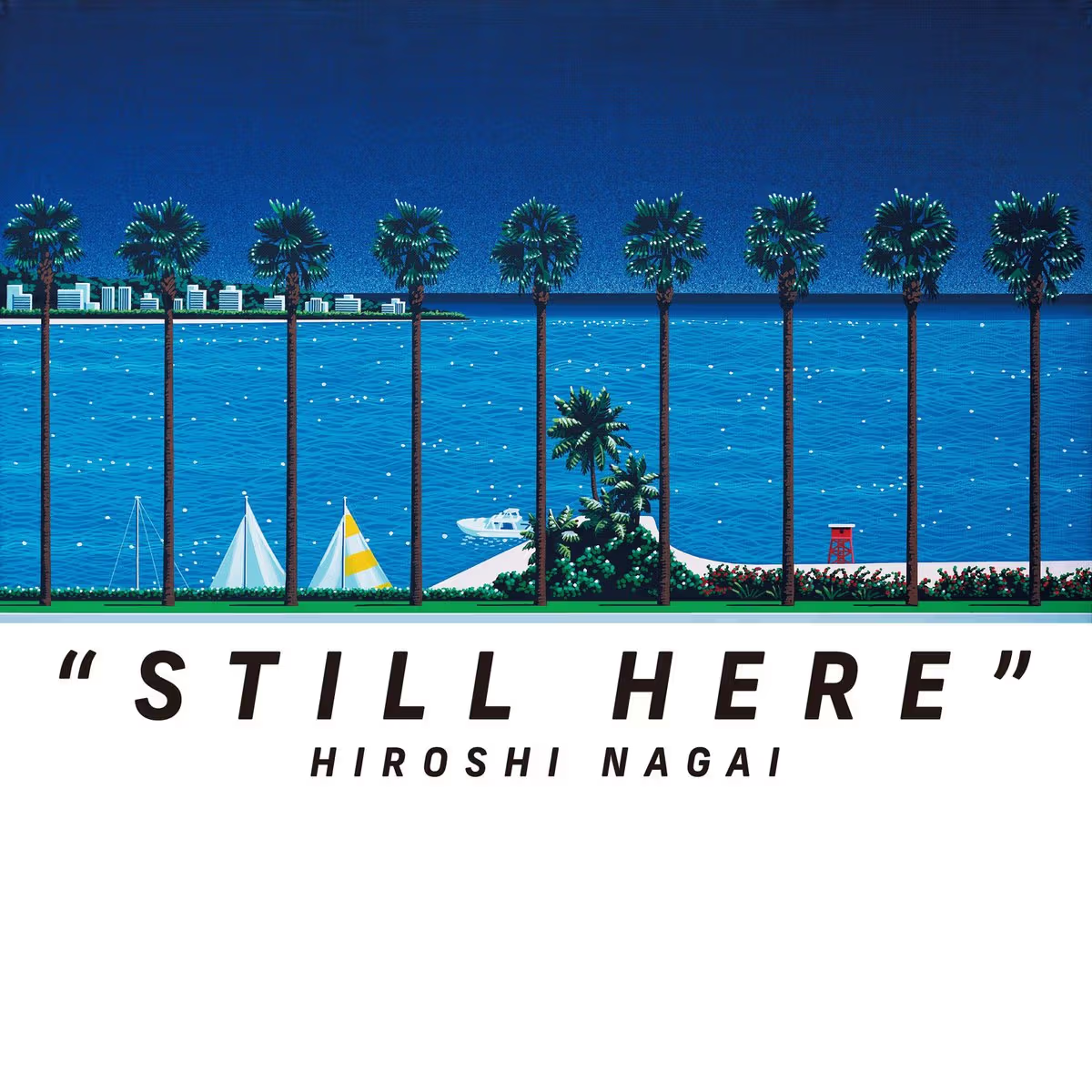
The STILL HERE exhibition graphic combines a coastal scene with its title.
STILL HERE places new and older works together, encouraging comparison through detail rather than a search for the most familiar cover. With approximately 20 pieces, visitors can repeatedly examine compositions: where the horizon sits, how palms divide the sky, and how pool edges lead from the foreground into the distance. These questions begin with the image and do not require a comprehensive record collection.
How do pools, evening colours and buildings compose a scene?
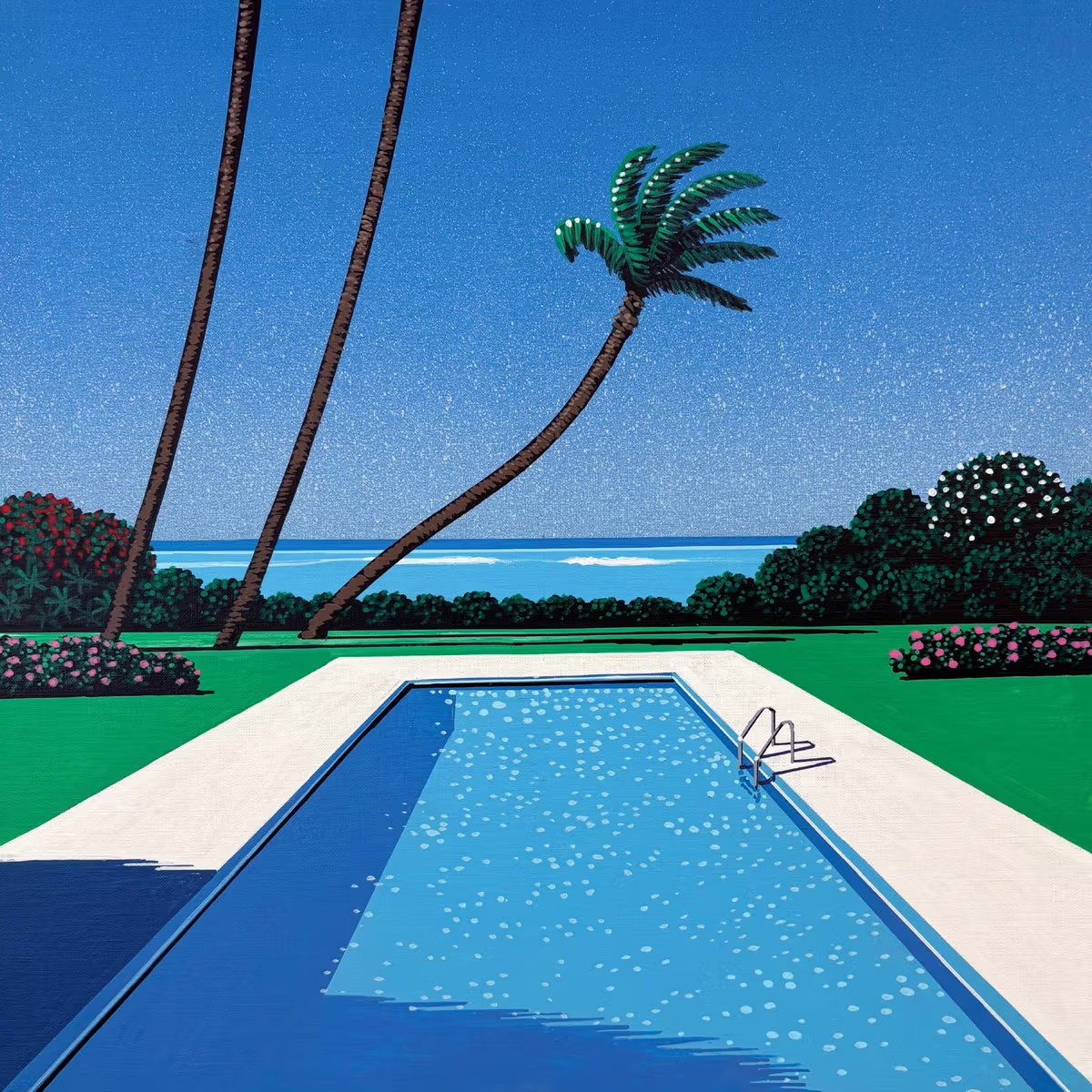
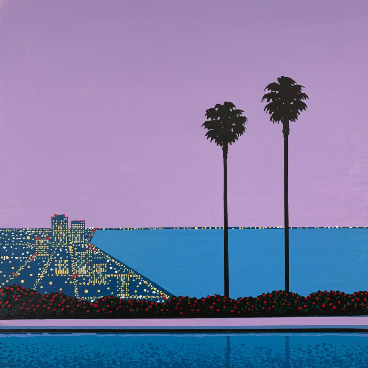
In one published work, a broad blue pool occupies the centre, with its white border, lawn and palms forming distinct areas of colour. Another reduces palms to near-silhouettes before a violet sky and waterfront buildings. Similar elements, arranged within different colour temperatures, suggest different senses of time. These are observable pictorial changes, rather than evidence that each painting depicts a particular real holiday destination.
Palms, buildings and water create layers beneath a violet sky.
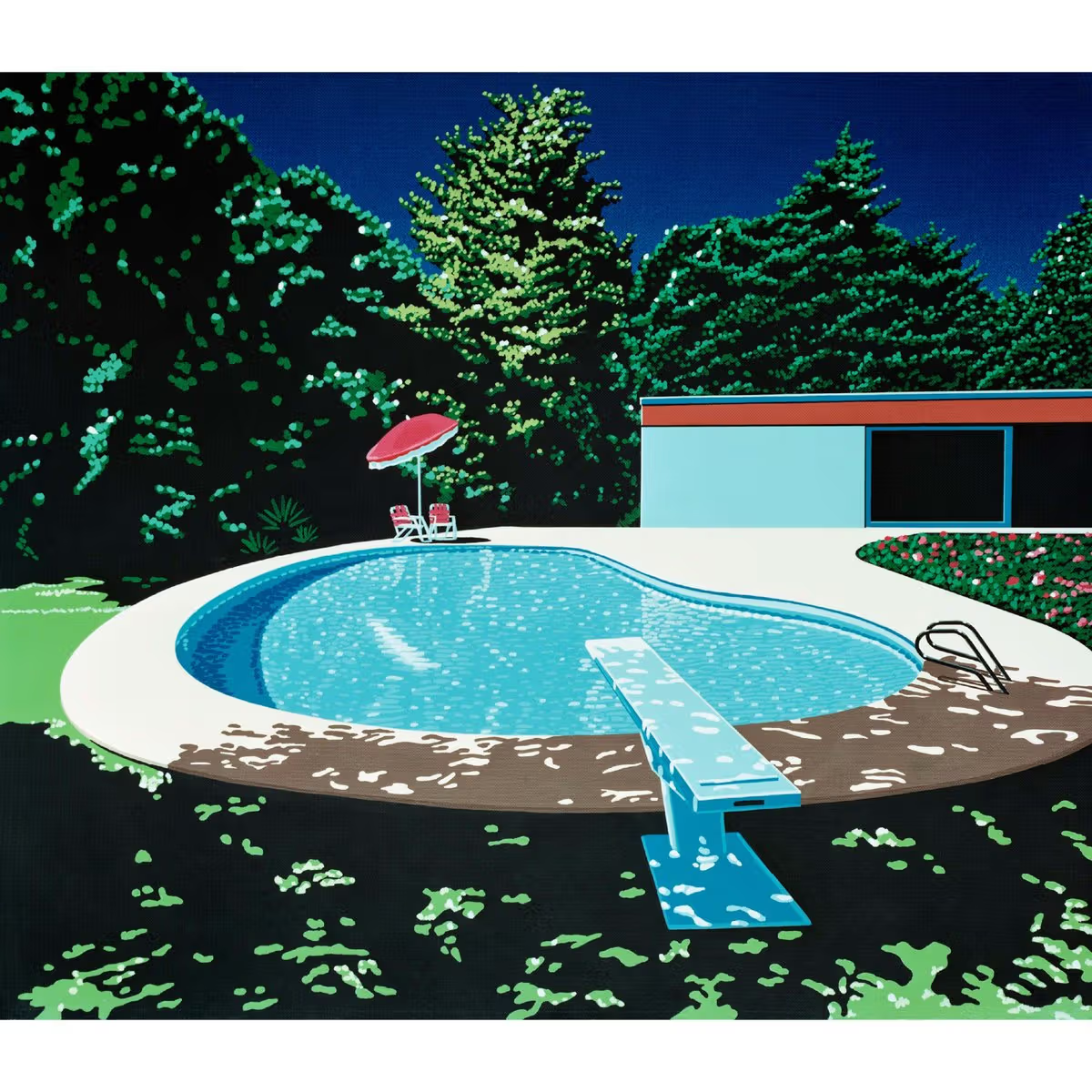
A further image shows a curved pool enclosed by dark green trees, with a red parasol providing a small bright accent. Differences between curves and straight lines, still water and dense plants move the eye through a quiet scene. Treating such images only as nostalgic backgrounds can overlook their organisation of depth and colour proportions. Those concrete relationships provide a firmer starting point than assigning a story to every work.
A curved pool contrasts with dark trees and a red parasol.
Distinguishing originals, reproductions and exhibition information
The special display of the Kimi wa Tennenshoku original is a useful point of focus for music listeners, while the approximately 20 new and older works allow broader comparisons. Images reduced or rearranged for records, books and phones have a different proportional relationship from an original. Visitors can look for dimensions and display information, turning familiar-image recognition into observation of composition, without assuming a screen reproduces the original colours precisely.
The exhibition has already opened and ends November 13 at GALLERY TARGET in Shibuya, Tokyo. Check the gallery’s official website for current opening arrangements and notices before travelling. The images here are published artwork images, not photographs taken during a TIDEZINE visit. For a Harajuku or Shibuya itinerary, the exhibition offers an art stop with specific visual reference points, reconnecting memories of record sleeves with the compositions in front of the viewer.